Imagine yourself wandering through the aisles of your local grocery store. Admire the rich crimson tomatoes neatly spread out near the bright green heads of lettuce. Stop to gaze at the neat rows of skewered meat. Finally, delight in the lovely rows of pastry in the bakery department. All these delectable food items that excite your sense of taste also catch your eye with their bright colours. Grocery store lighting cleverly enhances the beauty of food and attracts the consumer’s attention to particularly well-displayed products. Appropriate lighting makes food appear savoury. Read on to find a few tips on selecting lighting that will bring your fresh food selections into focus.
Greener Grocery Stores
Faced with the ever-increasing need to “Go Green” and “Promote Sustainability” through various programmes such as Green Globes and the Canada Green Building Council, LED-based lighting technology is the preferred solution to harmonizing efficiency and sustainability. “Today, LED lighting is no longer at the experimental stage. It’s a technology that has proved successful and offers a temperature colour of the highest quality. It enhances the value of a product and generates visual comfort that appeals to consumers,” explains Steven Fauteux, Director of Product Innovation at STANDARD.
The Right Colour for Each Food
The number of food items that deserve optimal presentation on today’s grocery shelves is growing by leaps and bounds. It is critical that each one appears at its freshest to attract shoppers. For instance, tomatoes should dazzle with their bright red colouring. The variegated hues of yellow, wheat and brown need to enhance the assorted collection of bakery goods. The silvery tones and sparkling blue highlights of the fishmonger’s display ought to attract customers far and wide. It is vital that store owners take colour temperature and colour rendering into account when setting up their lighting systems. Learn more about colour temperatures and their impact.
1. Butcher’s Shop
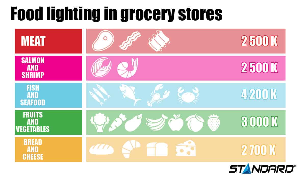
When you want to highlight meats that you arrange in your butcher’s display cases, make sure the predominant colour is red. It makes the meat look so appetizing! Often, lighting systems in this department don’t offer a proper red tone. Showcase the true quality of your meat with a light source with a good R9 rendering. Learn more about the colour rendering index and how to select lighting that enhances the true colours of your store’s merchandise. When you plan your lighting arrangement in the butcher’s shop or the fishmonger’s section, you need to install your light sources a fair distance from the meat and fish to avoid heat from these sources on the food items compromising the meat or fish’s lifespan.
2. Fishmonger’s Display
Salmon and shrimp should be displayed in a warm-coloured setting to exhibit their pink hue, whereas white-fleshed fish as well as seafood look much more appetizing when displayed in a blueish light. We often find these two groups of fish in a single area, but their divergent lighting coverage is not necessarily contradictory as warm and cold colours do harmonize quite adequately. However, in cases when it’s not possible to install two distinct sets of lights for the fishmonger’s department, we recommend a colour temperature of 4000K.
3. Fruit and Vegetables
The colour of fruit and vegetables is far more appealing under natural light, closer to warmer shades. We recommend a colour temperature of 3000K.
4. Bakery
Warm colours such as yellow, brown and shades of orange of bread can be enhanced under a warmer glow, thus making the baked goods look quite appetizing!


